
In this article, we’ll explore how to bring character and life to your small English townhouse using vibrant paint colors. English townhouses have a certain charm — rows of brick façades nestled along tree-lined streets, with sunlight streaming through tall windows and narrow hallways that seem to whisper stories from the past. But despite their appeal, these homes often share one common challenge: limited space.
With their long and narrow layouts, small square footage, and tucked-away corners, townhouses can feel cramped. Many people lean toward neutral tones in an effort to make these spaces feel more open. But neutral doesn’t always equal stylish.
That’s where bold paint colors come in. A well-chosen color can do much more than just brighten a room—it can reshape the perception of space, set the tone of the atmosphere, and even affect your mood. In a small home, every detail counts—and paint might be your most powerful tool for transformation.
The goal isn’t to throw color around randomly. It’s about making thoughtful choices, reading the light correctly, and using color strategically to make the most of every inch. Whether you love deep navy blues, want to energize your space with sunny yellows, or crave the drama of emerald green, this guide will walk you through how to bring vibrant colors into your English townhouse, step by step.
Let’s dive in:
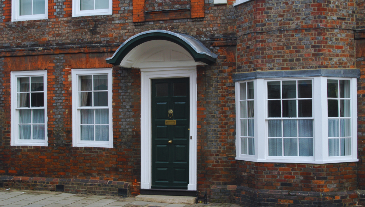
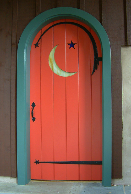
Your front door is the first impression your home gives—and it deserves better than boring white or beige. On a street of similar façades, a boldly painted door can instantly stand out. Navy, hunter green, burnt orange, or a vibrant red are perfect ways to show off your style.
This choice acts like a personal invitation reflecting the character of your home. Historic homes can pay homage to the past with deep red or forest green, while a pop of lemon yellow or cobalt blue brings a fresh, modern vibe. Plus, it’s a weekend project that can make a major impact without major effort.
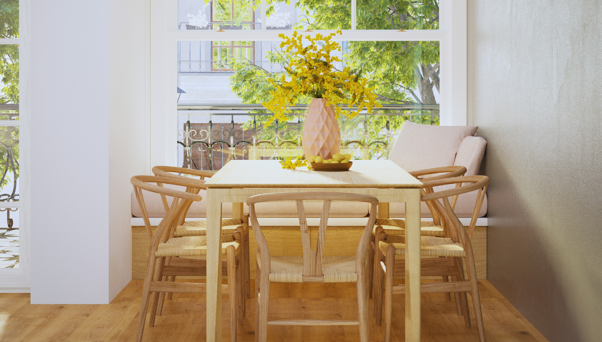
Open-plan layouts are both an advantage and a challenge in small homes. The same room might serve as your lounge, dining, and work area. Instead of dividing it with physical walls, use color to visually separate the spaces.
For example, paint the wall behind your dining table a warm mustard, and go for a calming sage green in the living area. A focused blue in the workspace boosts concentration. This technique not only brings order but also adds personality to every corner.
And don’t just think horizontally—color blocking vertically can also add visual rhythm to long walls. Try painting the lower third of the wall a contrasting color or using crisp lines to break monotony.
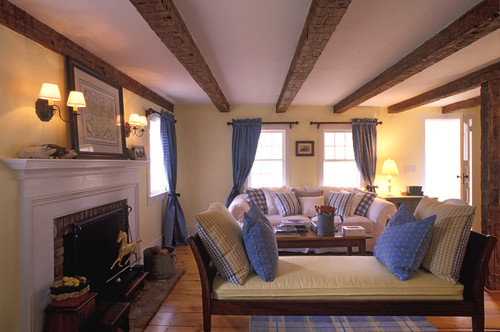
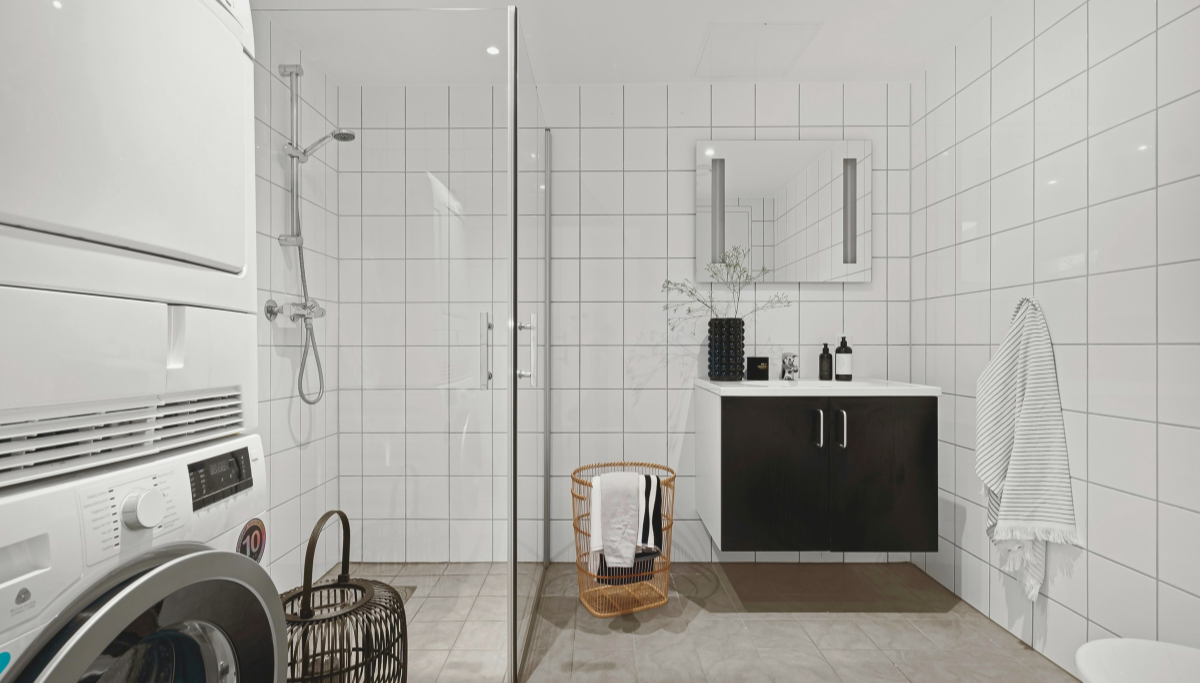
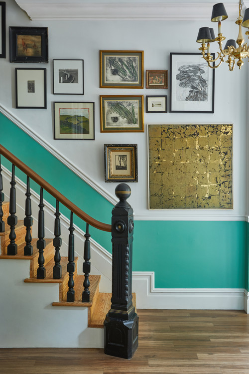
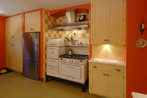
Small rooms shouldn’t be sentenced to pale tones just to “look bigger.” In fact, bold colors can make tiny spaces feel rich and full of personality. Try emerald green in the guest WC, midnight blue on the stair wall, or coral in an under-the-stairs reading nook.
These areas become surprise moments in the home—like little jewels waiting to be discovered. Enhance the effect with mirrors, lighting, and metallic accents to make these compact but powerful spaces sparkle.
Looking for both drama and lightness? Two-tone walls are your friend. Painting the bottom half of the wall in a bold color and the top in a lighter one creates the illusion of height while adding warmth.
This works well in many areas—hallways, bedrooms, stairwells, even living rooms. Mustard and cream can bring a retro touch; olive green with white feels natural and calming. Add trim for a traditional look or leave it clean for a contemporary vibe.
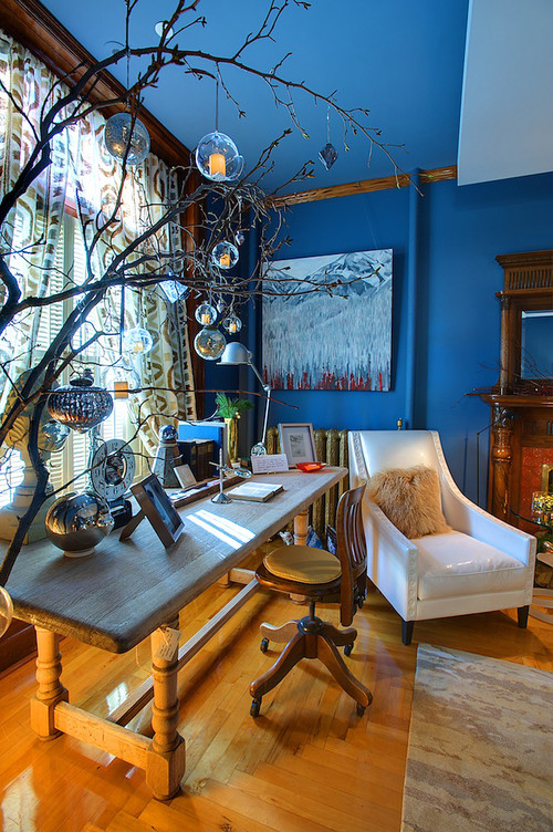
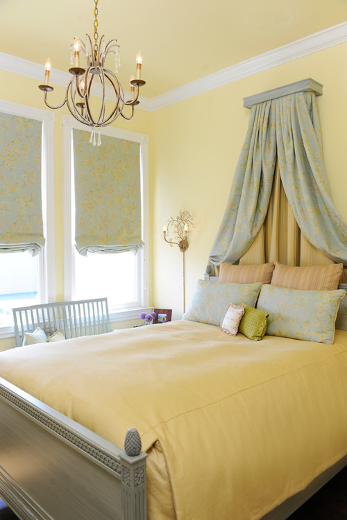
Ceilings are usually defaulted to white—but in small rooms, giving them a gentle pastel or soft contrasting color adds warmth and depth.
Think blush pink for the bedroom ceiling, light blue for the bathroom, warm beige for the kitchen. And don’t rule out dark ceilings—they can make a statement, especially if the room gets good light. Skirting boards and door frames offer another chance to play with contrast. Dark trim against light walls adds graphic interest and sharpens the room’s features.
A space should do more than just look good—it should reflect you. Don’t choose colors just because they’re trendy. Think about what stirs your emotions. A yellow that reminds you of Italy, a sea blue that evokes the coast, a nostalgic blush from your childhood…
These emotional links give color staying power and keep your space feeling personal and joyful. Your inspiration could come from a painting, a favorite outfit, or even a landscape. Let your walls tell your story.
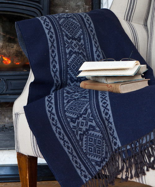
Color alone isn’t enough. Texture and light are crucial in balancing bold choices—especially in small spaces.
Natural materials like rattan chairs, linen curtains, soft wool throws, and rustic ceramics help ground rich colors. Mirrors and layered lighting (wall sconces, lamps, ceiling lights) bring the hues to life and make your space feel open and inviting.
Your tiny English townhouse doesn’t have to limit you. On the contrary, smaller spaces can become more expressive with thoughtful decisions and bold moves. In this context, color is not just decoration—it’s a language of expression. It reflects your mood, energizes your space, and makes your home unmistakably yours.
Paint is one of the most affordable and effective tools of transformation. Don’t be afraid to make mistakes—paint is easy to change. But when the right color lands in the right spot, the effect is magic.
So be bold. Paint that wall you’ve been hesitating on. Color the ceiling. Highlight that forgotten corner. Your home may be small, but your imagination is limitless.
I hope this guide has been helpful to you, my dear readers. Until the next article—stay inspired, and stay colorful!
With love,
Zeynep Aker